What Are the Top Event Directional Banner Types in 2026?
As event spaces become more complex in 2026, clear wayfinding will matter more than decorative impact. Guests should locate registration, restrooms, stages, and exits without stopping every few minutes. An Event Directional Banner can provide that guidance while reinforcing the event’s visual identity. The right format depends on venue size, visitor flow, viewing distance, and setup restrictions.
This guide examines practical banner types for conferences, festivals, trade shows, and community gatherings. It considers freestanding retractable banners, hanging signs, feather flags, A-frame displays, and modular fabric systems. Each option behaves differently. A retractable banner works well beside a registration desk. A feather flag attracts attention outdoors but may move in strong wind. Hanging banners can guide large crowds, yet they require approved fixing points and careful height planning.
Small details often shape the guest experience. Use large lettering, strong contrast, directional arrows, and consistent color coding. Keep critical information visible from several steps away. Test the banner from a visitor’s eye level, not only from the designer’s screen. That mistake happens often. It can make a polished sign difficult to read.
Experienced event teams also review venue rules, accessibility needs, lighting conditions, and emergency routes before printing. No single banner type suits every event. A design that succeeds in a bright exhibition hall may fail beside a shaded outdoor entrance. The recommendations ahead combine practical observations, production considerations, and reliable planning principles. Some choices may still require adjustment after a real site inspection. That is not a weakness. It is responsible event communication.
How Event Directional Banners Support Visitor Navigation
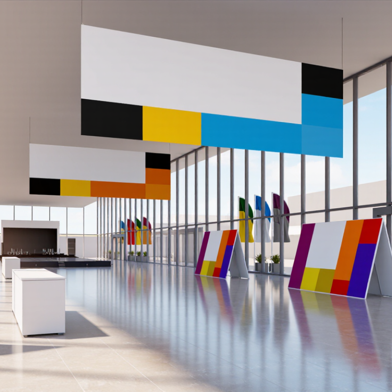
Directional banners work best when they answer one question at a time: Where is registration? Which hall holds the keynote? In 2026, common options include freestanding retractable banners near entrances, suspended signs above busy walkways, and weather-resistant banners leading visitors between outdoor areas. Each format solves a different visibility problem. A tall sign can guide people across a crowded lobby, while a hanging banner stays visible above shoulder-level traffic. Keep arrows large and wording short. “Hall B →” is easier to scan than a full sentence.
Placement matters as much as format. Put signs before a decision point, not after it, and repeat key directions at turns where visitors might hesitate. Use consistent colors for separate zones, but keep strong contrast between text and background. A quick walk-through at visitor eye level can reveal blocked sightlines, glare, or an arrow that points too vaguely. Small details count. Still, banners cannot repair a confusing floor plan, and too many signs can create visual noise. Check the route with someone unfamiliar with the venue; their pauses may show where the directions need work.
Retractable and Freestanding Banners for Flexible Guidance
What Are the Top Event Directional Banner Types in 2026?
Retractable and freestanding banners help guide guests without fixed signs or complicated installations. A retractable banner rolls into its base for transport and storage, making it useful for check-in desks, conference entrances, and temporary queue changes. Its narrow footprint suits tight indoor spaces. Freestanding banners offer more flexibility in shape and placement, especially when a sign needs to stand beside a hallway or mark a changing route. Check that the base feels stable on the venue’s flooring. A banner can look clear in a quiet room and still disappear in a busy crowd.
Tips: Place signs where guests must choose a direction, not after the turn. Keep arrows large, wording brief, and contrast easy to read from several steps away. Walk the route at guest eye level before doors open. Watch for glare, open doors, and people blocking the view. Small details matter.
Use retractable displays when setup speed and compact storage are priorities. Choose freestanding options when you need adaptable placement or a broader visual panel. Neither type replaces thoughtful wayfinding: repeated signs should use consistent wording and point in the same direction. Measure the available space before printing, and test the layout with actual foot traffic if possible. I have seen even a polished sign fail when placed behind a table. That is easy to miss during planning.
Suspended, Wall-Mounted, and Pole-Mounted Banner Systems
What Are the Top Event Directional Banner Types in 2026?
Suspended, wall-mounted, and pole-mounted banner systems remain practical choices for guiding visitors in busy event spaces. Each format solves a different visibility problem. Suspended banners work well above registration zones, aisle intersections, and crowded entrances. They stay visible over people’s heads and keep floor paths clear. Use double-sided graphics when guests approach from opposite directions. However, ceiling height, rigging points, and approved load limits require careful checking before installation.
Wall-mounted banners suit corridors, stair approaches, meeting-room entrances, and temporary information points. They create a clean visual line without occupying valuable floor space. A matte surface can reduce glare under strong exhibition lighting. Mounting hardware should match the wall material, especially on painted drywall or uneven concrete. I have seen teams focus on attractive graphics and underestimate removal marks. That mistake becomes expensive.
Pole-mounted systems are useful outdoors, across campuses, and along parking-to-venue routes. Their height improves recognition from a distance, while weighted bases or approved ground fixtures improve stability. Wind changes quickly. Outdoor banners need suitable fabric, reinforced seams, and regular hardware inspections. Directional arrows should remain large, simple, and consistent with the venue map. Small text fails under pressure. Event planners should test each route at visitor eye level, not only from a design screen. A short trial walk often reveals confusing turns, blocked sightlines, or banners placed too late.
Digital and Interactive Directional Banners in 2026
Digital and interactive directional banners are becoming practical tools for event navigation in 2026. A bright screen near the entrance can show room names, arrows, and schedule changes. Touch-enabled displays let visitors search for a session or locate accessible routes. Keep the main direction visible without interaction; guests may be carrying bags or moving through a crowd. Clear labels matter. So does contrast.
Placement and maintenance shape whether these banners actually help. Put screens at decision points, such as hallway junctions, rather than every few metres. Use large arrows and short wording that can be read while walking. A staff member should check screen brightness, connections, and displayed information before doors open. Interactive maps can be useful, but tiny buttons and layered menus slow people down. Not every feature earns its space. A simple screen that works is often better than a clever one that fails. Some venues may also need printed signs nearby when screens are blocked, unavailable, or difficult to read. Test the setup from a visitor’s viewpoint, including the awkward corner where people tend to stop and look around.
What Are the Top Event Directional Banner Types in 2026?
Digital and Interactive Directional Banner Formats
The chart compares representative canvas resolutions, not market share or adoption. Landscape and ultrawide formats suit long routes and venue maps; portrait and square formats work well for entrances, kiosks, and compact interactive displays.